The Datasaurus 🦖
TidyTuesday 2020-10-13
If you want to join the next CorrelAid TidyTuesday Meetup, make sure to sign up to our Newsletter or reach out to us on Twitter!
library(tidyverse)
library(tidytuesdayR)
library(ggplot2)
library(fontawesome) # for knitting, install with devtools::install_github("rstudio/fontawesome")
tt <- tt_load("2020-10-13")
##
##  Downloading file 1 of 1: `datasaurus.csv`
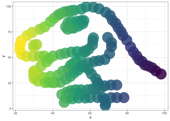
A colorful dino!
By Christina
datasaurus_dozen <- tt$datasaurus
ggplot(dplyr::filter(datasaurus_dozen, dataset=='dino'), aes(x, y, colour=-x)) +
  geom_point(size=15, alpha=0.85, shape=16) + theme_bw() +
  theme(legend.position = "none") +
  scale_color_continuous(type = "viridis")
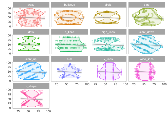
A colorful violin plot
ttd <- tt$datasaurus
ttd %>%
      ggplot(aes(x = x, y = y, fill = dataset, color = dataset)) +
      geom_smooth(method = "lm", alpha = 0.1, color = "grey") +
      geom_violin(alpha = 0.1) +
      geom_point(alpha = 0.3) +
      facet_wrap(~dataset) +
      theme_light() +
      theme(legend.position = "none",
            panel.grid = element_blank()) +
      labs(x = "", y = "") +
      NULL
## `geom_smooth()` using formula 'y ~ x'
An animation!
library(gganimate)
library(cumstats) # for cumulative standard deviation
library(dplyr) # to use dplyr's cummean not cumstats'
ds <- tt$datasaurus
ds <- ds %>%
  group_by(dataset) %>%
  arrange(x, .by_group = TRUE) %>% # arrange by x to get cumulative values that we use for the animation
  mutate(n = 1:n(), cum_mean_y = cummean(y), cum_var_y = cumvar(y)) %>%
  mutate(cum_sd_y = sqrt(cum_var_y))


a <- ggplot(ds, aes(x = x, y = y))+
    geom_point(color = "darkgrey", size = 0.5)+
    geom_hline(aes(yintercept = cum_mean_y, color = dataset))+
    geom_text(aes(label = round(cum_sd_y, 1), color = dataset), x = 85, y = 10, size = 3)+
    theme_light()+
    theme(legend.position = "none")+
    labs(title = "Cumulative Mean and Standard Deviation of Y", caption = "Standard deviation in the bottom right corner of each plot.")+
    facet_wrap(~dataset, ncol=4)

an <- a +
     transition_time(n)+
  shadow_mark(exclude_layer = c(2, 3))
# animate(an, renderer = gifski_renderer()) # commented out for knitting
# gganimate::anim_save("reveal_mean.gif") # commented out for knitting
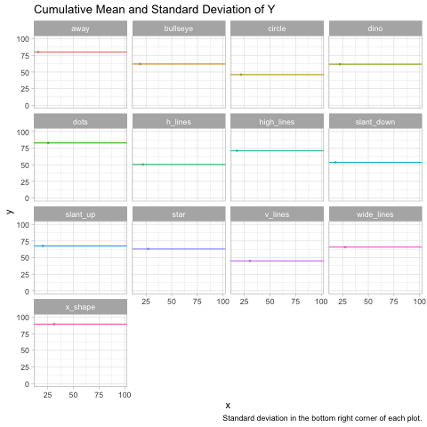
late night #tidytuesday submission..i just couldn't wrap my head around the fact that indeed, those points really “end up” with the same mean and standard deviation. so i plotted it to convince myself. :) #rstats #ggplot pic.twitter.com/O2IoSPmCou
— Frie (@ameisen_strasse) October 13, 2020
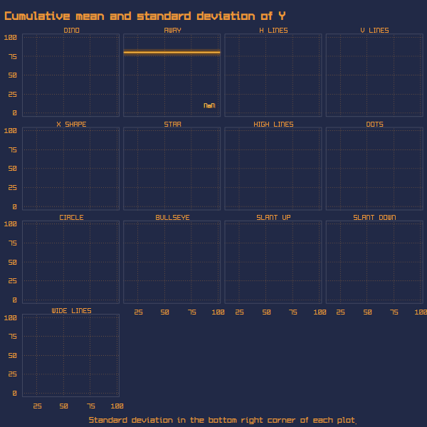
Update: Long (see next contribution) did this amazing cyberpunk edit - for even better laser beams effects! Amazing theme, come through.
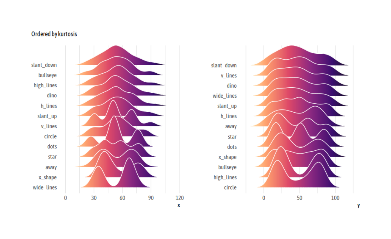
A joy plot - oh joy!
Long created a helper function for the grid and also has his own ggplot theme which he shared here. This code here does not include the theme because it requires installing fonts etc.
library(tidyverse)
library(tidytext)
library(ggridges)
library(PerformanceAnalytics)
Helper function panel_grid
panel_grid <- function(grid = "XY", on_top = FALSE) {
  ret <- theme(panel.ontop = on_top)
  if (grid == TRUE || is.character(grid)) {
    if (on_top == TRUE)
      grid_col <- "#ffffff"
    else
      grid_col <- "#cccccc"
    ret <- ret + theme(panel.grid = element_line(colour = grid_col,
                                                 size = .2))
    ret <- ret + theme(panel.grid.major = element_line(colour = grid_col,
                                                       size = .2))
    ret <- ret + theme(panel.grid.major.x = element_line(colour = grid_col,
                                                         size = .2))
    ret <- ret + theme(panel.grid.major.y = element_line(colour = grid_col,
                                                         size = .2))
    ret <- ret + theme(panel.grid.minor = element_line(colour = grid_col,
                                                       size = .2))
    ret <- ret + theme(panel.grid.minor.x = element_line(colour = grid_col,
                                                         size = .2))
    ret <- ret + theme(panel.grid.minor.y = element_line(colour = grid_col,
                                                         size = .2))
    if (is.character(grid)) {
      if (!grepl("X", grid))
        ret <- ret + theme(panel.grid.major.x = element_blank())
      if (!grepl("Y", grid))
        ret <- ret + theme(panel.grid.major.y = element_blank())
      if (!grepl("x", grid))
        ret <- ret + theme(panel.grid.minor.x = element_blank())
      if (!grepl("y", grid))
        ret <- ret + theme(panel.grid.minor.y = element_blank())
      if (grid != "ticks") {
        ret <- ret + theme(axis.ticks = element_blank())
        ret <- ret + theme(axis.ticks.x = element_blank())
        ret <- ret + theme(axis.ticks.y = element_blank())
      } else {
        ret <- ret + theme(axis.ticks = element_line(size = .2))
        ret <- ret + theme(axis.ticks.x = element_line(size = .2))
        ret <- ret + theme(axis.ticks.y = element_line(size = .2))
        ret <- ret + theme(axis.ticks.length = grid::unit(4, "pt"))
      }
    }
  } else {
    ret <- theme(panel.ontop = FALSE)
    ret <- ret + theme(panel.grid = element_blank())
    ret <- ret + theme(panel.grid.major = element_blank())
    ret <- ret + theme(panel.grid.major.x = element_blank())
    ret <- ret + theme(panel.grid.major.y = element_blank())
    ret <- ret + theme(panel.grid.minor = element_blank())
    ret <- ret + theme(panel.grid.minor.x = element_blank())
    ret <- ret + theme(panel.grid.minor.y = element_blank())
  }
  ret
}
The plot
datasaurus <- tt$datasaurus
p <- datasaurus %>%
  pivot_longer(-dataset) %>%
  ggplot(aes(value,
             reorder_within(dataset, value, name, PerformanceAnalytics::kurtosis),
             fill = stat(x))) +
  geom_density_ridges_gradient(colour = "white", show.legend = FALSE,
                               scale = 3, rel_min_height = .01) +
  scale_y_reordered() +
  scale_fill_viridis_c(option = "A", direction = -1) +
  facet_wrap(~name, scales = "free") +
  labs(x = NULL, y = NULL, subtitle = "Ordered by kurtosis") +
  panel_grid("Xx") +
  theme(axis.text.y = element_text(vjust = 0))
# p # commented out for knitting , instead we include the themed version. see the gist for the theme
Resources and snippets from the Slack
- If you want to check that it’s really true
ds %>%
  group_by(dataset) %>%
  summarize_all(list(mean = mean, sd = sd))
- gganimate Datasaurus submission from the gganimate wiki
- Same Stats, Different Graphs: Generating Datasets with Varied Appearance and Identical Statistics through Simulated Annealing (Justin Matejka, George Fitzmaurice)
- The emo package if you want to embed emojis in R
- David Robinson’s TidyTuesday screencasts